Skip to main content
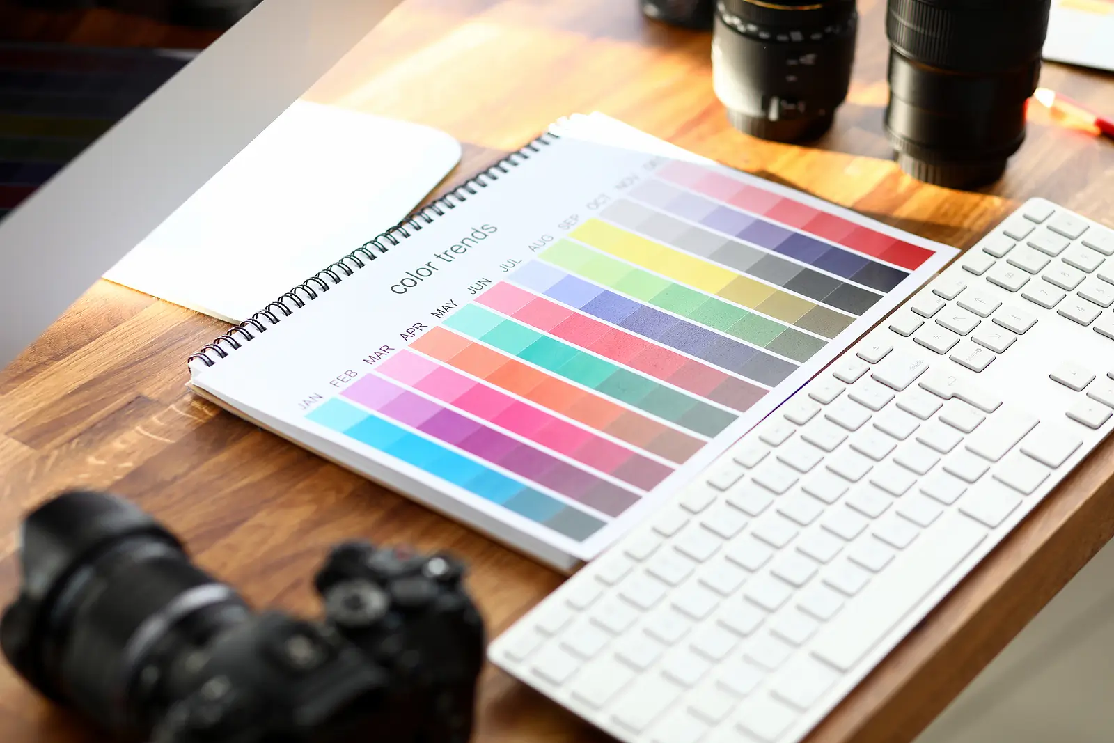
We’ve entered the Era Tour of interior design, where every room deserves its own personality, and color sets the tone for the story you’re telling.
Gone are the days of “renter beige.” 2026 invites landlords to be the curators of their property’s next hit era, whether it’s Midnight Blue, Evergreen, or Reputation Red, which will complement their design world.
Color isn’t just decoration anymore; it’s marketing, mood, and memory. And when used right, it can make your property the main character that tenants never want to leave and the lead star in the property domain for the coming years.
Key Takeaways
Color has economic impact: the right paint and tones can elevate your property’s style and perceived value.
Earth tones and neutral hues offer timeless appeal that tenants associate with calm and comfort.
Investing in modern color palettes now positions your property for success in the years to come.
The Psychology of Color: How Tenants Feel What They See
Color isn’t random, but it’s a matter of psychology. Color psychology reveals that warm hues evoke a sense of comfort, while cool tones convey sophistication. Tenants aren’t just renting rooms; they’re renting an environment that shapes their understanding of life and their sense of balance.
When your interiors reflect serenity and warmth, you’re not just leasing space, but you’re selling a feeling.
2026 Design Trends: The Return of Natural Beauty
The design trends for 2026 celebrate the beauty of natural colors and earth tones. From soft clay and olive to sand and warm browns, designers predict a global shift toward grounded aesthetics.
It’s about creating spaces that calm the mind while keeping an organic sense of movement and depth.
Universal Khaki: The Hidden Gem of Neutrals
If one shade defines 2026, it’s Universal Khaki, the hidden gem among neutral colors. It’s neither bland nor bold, but beautifully balanced. Use it for walls, cabinets, or furniture bases to create a cohesive look.
As an ideal choice for commercial spaces and apartments, it offers flexibility and understated beauty.
Warm Eucalyptus: Calm, Green, and Grounded
Warm Eucalyptus is a top pick among interior designers. This soothing green hue adds freshness without overwhelming the space.
Perfect for an accent wall or built-in side tables, it introduces more warmth while staying modern and earthy.
Warm Mahogany: Where Depth Meets Drama
For landlords seeking to add depth, Warm Mahogany brings rich sophistication. This color of the year contender combines red and brown tones, creating a sense of movement and confidence.
It’s perfect for dining areas or furniture details, adding a sense of timeless style to your property.
The Enduring Appeal of Neutral Colors
Neutral hues are still the backbone of modern interior design. They provide balance, light, and versatility. Gray, beige, and ivory remain essential, but 2026 sees these neutral shades evolving into warmer, softer, and more layered textures for added depth.
Layered Neutrals for a Calming Environment
Layering neutral colors creates serenity. Think of sand walls, linen curtains, and ivory trims. The goal is to create spaces that are both restful and elegant.
Pair wood and natural materials for softer warmth that invites tenants to stay longer.
Bold Meets Subtle: The Art of Contrast
Contrast defines modern interiors. Combine neutral walls with bold accessories, such as orange pillows, blue rugs, or dark wood sideboards.
A well-placed contrast reflects confidence and brings energy to every room.
Earth Tones: Nature's Whisper Indoors
Tenants crave connection to nature, even in urban environments. Earth tones, such as browns, greens, and terracottas, bring the outdoors in.
These earthy palettes make spaces feel grounded and timeless, connecting design elements with a sense of comfort and warmth.
Ceiling Treatments: Look Up to Style
Your ceiling is no longer an afterthought. In 2026, ceiling treatments are trending, from soft neutral hues to bold accent colors.
Painting your fifth wall adds more depth and visual movement, giving your interiors a modern twist that tenants love.
Highlighting Architectural Details
Color can emphasize architectural details that often go unnoticed. Use darker tones for trims or beams to create contrast against light walls.
These design elements draw attention to craftsmanship, adding beauty and character to your space.
The Rise of Rich Hues
While neutral hues dominate, rich colors like navy, emerald, and burgundy are making a comeback. They infuse rooms with warmth and personality.
Used sparingly, these colors bring depth and define focal points without overwhelming light.
Modern Color Palettes for Commercial Spaces
For commercial spaces, designers are using color palettes that blend professionalism with a touch of personality. Try pairing universal khaki with warm eucalyptus or gray with wooden tones.
These combinations create balance while maintaining a sophisticated, rentable environment.
Using Color to Define Purposeful Rooms
Color can define function. Interior designers use zoning to separate spaces through the use of paint.
Blue promotes calm in bedrooms.
Yellow boosts creativity in offices.
Warm brown ground living areas.
This approach helps tenants visualize the sense of purpose in each room.
Color of the Year: Meaning and Message
The color of the year often mirrors societal emotions. In 2026, experts predict hues that inspire calm, creativity, and renewal.
These colors bridge past and future, blending nostalgia with modern energy, a reflection of resilience and a desire for authentic living.
Creating Spaces That Reflect Warmth and Life
Your interior design choices have a direct impact on the tenant experience. Use paint and materials that reflect light, balance warmth, and add depth.
Warm mahogany cabinetry, green plants, and soft neutral walls can transform a space into a home filled with life.
Blending Color with Personality and Purpose
Significant design trends don't just follow fashion, but they tell a story. Combine natural colors, modern tones, and layered palettes to create spaces that appeal to both the heart and the mind.
When tenants feel that emotional connection, they see a rental as a home, not just a property.
FAQ: What Landlords Often Ask About 2026 Color Trends
1. How can I use trending colors without overspending on renovations?
Focus on accent walls or repainting side tables and cabinets. Small changes in paint or accessories can make a massive difference while saving money.
2. Which colors work best for smaller apartments or limited light?
Opt for neutral hues like universal khaki or warm eucalyptus. These shades enhance light reflection, making rooms appear larger and brighter.
3. How can I make my property feel modern yet timeless?
Balance neutral tones with one or two bold, rich hues. This approach captures modern energy while preserving classic beauty.
Paint Your Property's Success Story
Your walls aren't just boundaries, but they're opportunities. In a world where design meets investment, the trending interior design colors for 2026, which aim to attract tenants, offer a roadmap to profitability. The right colors can create balance, evoke warmth, and bring life to every room.
Suppose you're ready to transform your property with expert guidance. Partner with us at Renter's Warehouse Hampton Roads, as we stay informed about the design trends shaping the future. Our services, including maintenance, marketing, and others, will enhance your property management journey.
Together, let us craft interiors that not only rent quickly but also reflect timeless style, depth, and allure.
Other Resources:
A Landlord's Guide to Expense Reporting in Hampton Roads
Commercial vs. Residential Real Estate: Which is Better for You in Hampton Roads?